Brand guidelines · v1.0 · 2026
Modern Sense
Modern Sense sells calm. Every expression of the brand — a page, a photograph, a delivery note — should feel like walking into a bright, quiet room: warm, uncluttered and certain of itself. These guidelines keep it that way.
01
The wordmark
Type is the logo. The wordmark is Engravers' Gothic, always uppercase, tracked at 380 thousandths of an em. No symbol, no container — the space around it is the identity.
Clearspace
Keep a margin equal to the cap-height of the "M" on all sides. Nothing enters it — not photography, not other type.
Minimum size
14 px cap-height on screen, 5 mm in print. Below that, use the MS monogram: MS
Never
- — Tighten or reduce the tracking
- — Set it in another face or weight
- — Use any colour but Ink or Bone
- — Place it over busy photography
02
Typography
Two voices, strictly cast. Engravers' Gothic speaks in short, wide-tracked labels — never sentences. ABC Diatype does everything else.
Display — Engravers' Gothic
Aa Bb Cc
Eyebrows · Section labels · Buttons · The wordmark
Always uppercase. Tracking between 0.28em and 0.38em. Never below 10px, never in running text, never bolded — its width is its weight.
Text — ABC Diatype
Aa Bb Cc
Regular 400 — body, product copy, descriptions
Medium 500 — product names, emphasis
Bold 700 — reserved for numerals in data
Headlines set in Regular at large sizes with default tracking. Body at 14px/1.6. Prices always tabular.
03
Colour
A warm monochrome. Eight tones from bone to ink, one clay accent. Saturated colour belongs to photography, never to the interface.
The field. Every page starts here — at least 60% of any layout.
Surfaces: cards, image mats, quiet panels.
Fills, hover states, the packshot backdrop family.
Strong hairlines and inactive UI.
Captions, metadata, tertiary type.
Secondary type — long-form body copy.
Primary type, buttons, the wordmark. Never pure black.
The single accent. Offers, low-stock, flagship tags. Use sparingly.
04
Imagery
Photography is the only place the brand gets loud — and even then it whispers. Three image types, one light: soft morning daylight, warm off-white surroundings, generous negative space.
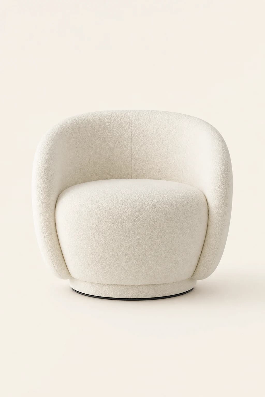
A — The packshot
- — Seamless warm off-white backdrop (#F2EEE6)
- — Piece centred, soft shadow beneath
- — Diffused daylight from the upper left
- — No props. Ever.
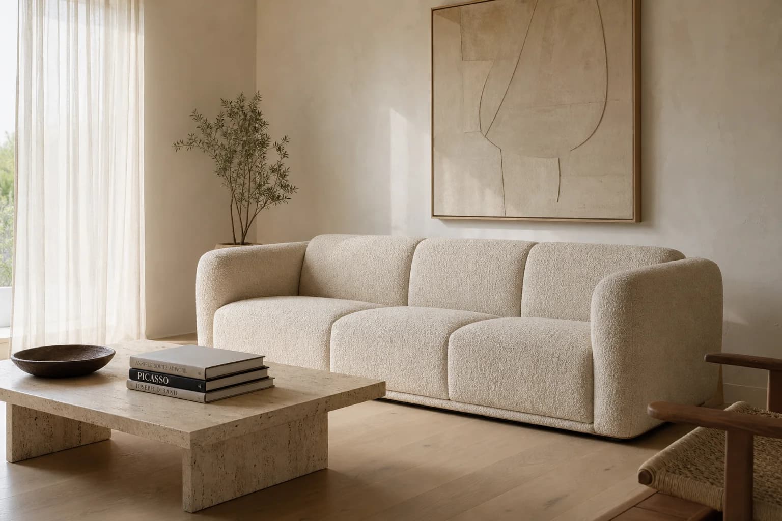
B — In situ
- — Off-white plaster walls, pale oak floors
- — Morning light through sheer linen
- — Sparse styling: one book, one ceramic
- — The room breathes — at least half the frame is empty
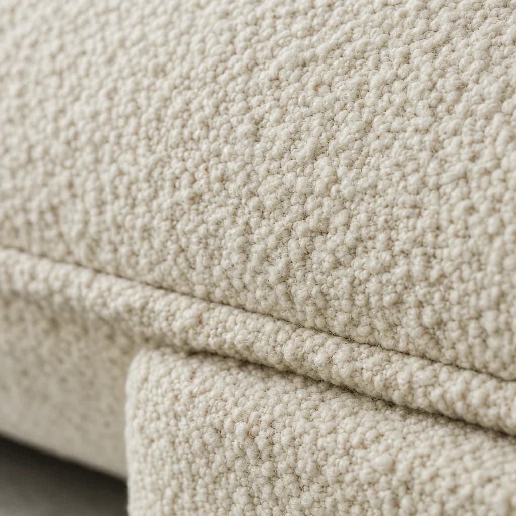
C — The detail
- — Macro on material: weave, grain, pore
- — Shallow depth of field
- — Used to prove quality, not to decorate
05
Thumbnails & cards
Product thumbnails are the most repeated brand asset — they must be interchangeable like bricks.
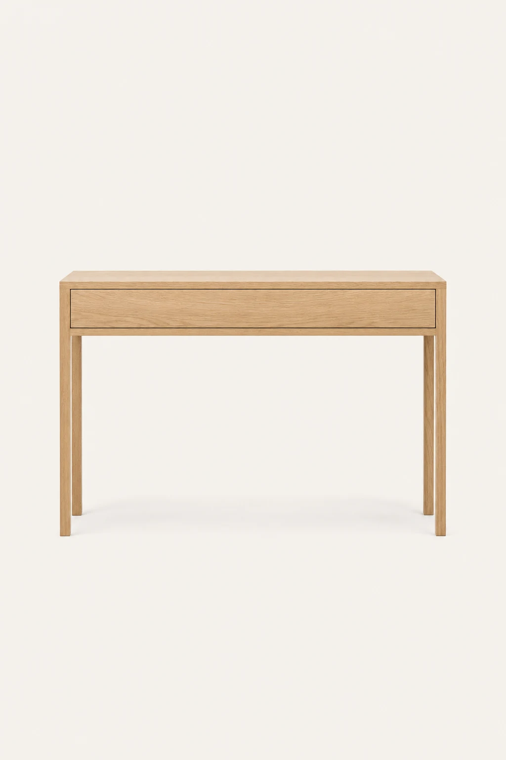
- Ratio
- Always 2:3 portrait, shot in-camera — never cropped. The piece spans ~62% of the frame width with clean background margin on every side.
- First frame
- The default colourway packshot. Lifestyle imagery is always the final frame in a card's rotation.
- Caption
- Name in Medium, type in Umber after a middle dot, price right-aligned and tabular:Ligne · Console Table $1,199
- Swatches
- 12px colour dots below the caption, actual fabric hex values. Colourway images are derived from the base shot by image-to-image editing, so geometry and light never shift between colours.
- Grid
- 12–16px gutters, 40px row gaps. Two columns on mobile, four at desktop. No card borders, no shadows — the ivory mat is the frame.
06
Voice
We write like the showroom staff talk: knowledgeable, warm, unhurried. Short sentences. No exclamation marks. No urgency theatre.
Say
A sofa is a decade-long decision. Sit on it first.
Never
Don't miss out on our AMAZING sofa sale!!
Say
Complimentary GTA delivery over $999.
Never
FREE SHIPPING (conditions apply — see details)
Say
Only 3 left across our stores.
Never
HURRY! Selling out FAST ⚡
07
Layout principles
The layout system in four rules — break one only when you can say why.
Negative space is the brand
If a layout feels empty, it's correct. Density is a failure state.
Hairlines, not boxes
Divide with 1px Greige rules. Cards and shadows are for other brands.
Square corners
Radius is 0 everywhere. Only colour swatches and status dots are round.
Type on the grid
Everything aligns to a 1600px max-width frame with 32px margins.